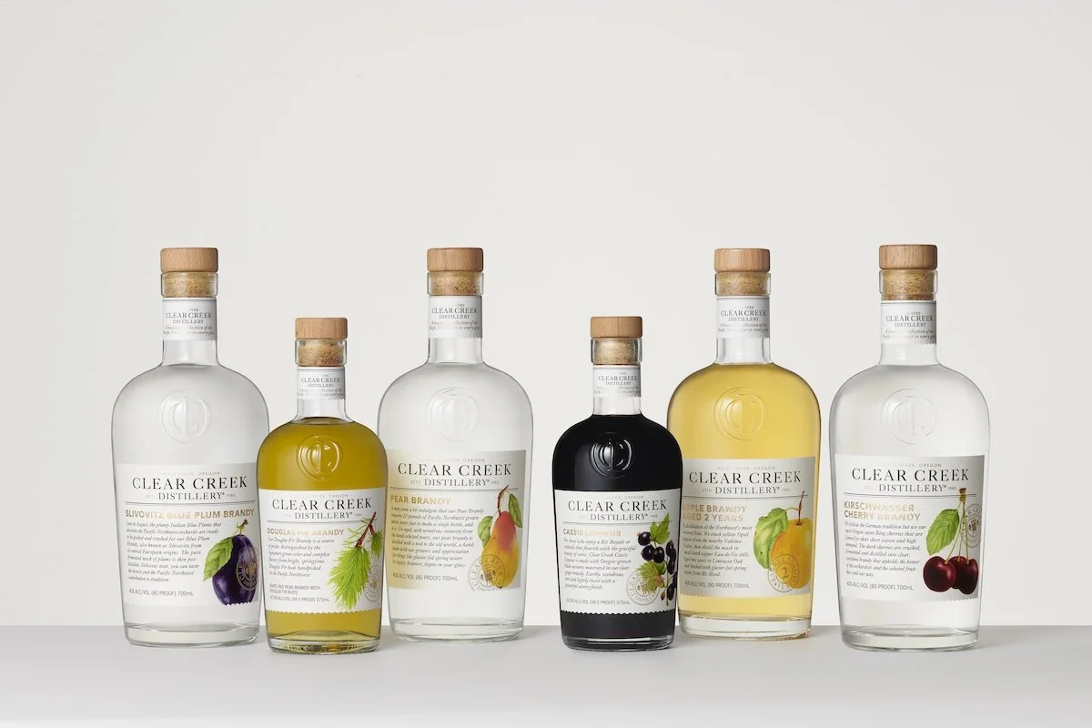
Painting Spirits: Watercolor Packaging Design for Clear Creek Distillery
I was commissioned by Sandstrom Partners to create multiple custom watercolor fruit illustrations for Clear Creek Distillery’s packaging design. Each illustration was a standalone fruit, painted with realism on paper, and later digitized for use across their labels and branding.
Image Credits: Polara Studio
Clear Creek Distillery has a rich story rooted in craft distilling, authenticity, and a deep connection to Oregon’s orchards. The task was to create fruit illustrations — pears, cherries, plums, and more — that reflected the freshness of the ingredients behind their spirits. These artworks would serve as the visual identity across their liquor label packaging design, helping their bottles stand out while honoring their artisanal heritage.
Behind the Scenes of the Process
I began with research into the fruits Clear Creek is known for, sketching and testing different approaches in watercolor. Each fruit needed to feel lifelike — not stylized, not abstract, but botanical illustrations painted with realistic watercolor detail.
Working with watercolor means balancing precision and unpredictability. For example, pears required layering multiple washes to capture their subtle gradients and glow. Cherries demanded rich tones without losing their natural light reflection. Each of the 16 illustrations became a study in color, transparency, and texture.
The process reinforced why I love traditional mediums for packaging illustration — the human touch and small imperfections add a warmth that digital work alone can’t replicate.
From Watercolor to Label Design
Once complete, the illustrations were carefully digitized so Sandstrom Partners could adapt them into label packaging design for Clear Creek Distillery. Seeing the transition from paper to bottle label was incredibly rewarding — proof that custom watercolor illustrations can elevate a brand’s identity and bring storytelling into spirits packaging design.
A Memorable Collaboration
The team at Sandstrom Partners was amazing to work with — collaborative, thoughtful, and committed to making the illustrations shine as part of the brand’s overall vision. It was truly a partnership, and I’d love the chance to work with them again on future packaging design projects.
This collaboration blended everything I love: food, botanicals, and storytelling through art. It’s a reminder that hand-painted illustration for packaging design is more than decoration — it’s a way to express the care and authenticity behind a product. For Clear Creek Distillery, the fruits themselves were the story, and watercolor was the perfect medium to capture their natural beauty.
✨ Ready to elevate your packaging with hand-painted illustrations? I work with distilleries, beverage brands, dairy and food companies to create custom watercolor artwork that brings your labels to life. Email me to start your project today!


